

Technology changes fast, and web design trends are no different. Globally, 175 new websites are created every minute, making it around 252,000 new websites everyday. What once were modern and innovative have now become outdated and overdone. Now users look for design elements and innovation that are simple and easy to use, yet highly functional.
Here are some of the latest trends in digital technology, website features and elements that look promising for 2023.
No. 1: Parallax Scrolling
Parallax scrolling is a popular web effect that is used to make certain aspects of a webpage more dynamic. It creates an illusion of depth to the page and is often used in full-width applications with image, video, and texture imagery. When the user scrolls past an image or video, it seems as though background images are moving slower than the foreground images. This behavior makes it seem like an image is placed behind the neighboring sections, making the content more engaging and appealing.
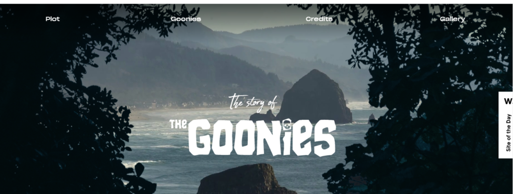
For example: in this Goonies website, you can see parallax scrolling in action making the content engaging.
No. 2: Smart Content Loading
Many websites may be guilty of having a heavy resource content with several graphical elements that takes time to load. Lucky, technological advancement has made it possible to develop smart websites that prioritize loading of the content.
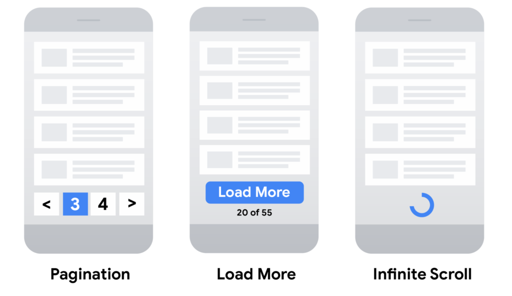
The technology behind smart content loading, Lazing loading, pagination and infinite scrolling, is not new. Many social networking websites, such as Facebook, Twitter, etc. have been using this for years. However, it is a recent concept in commercial websites that will continue to dominate web design for 2023.
Many visitors may not want to see the bottom of any page instantly. Therefore, to speed up the load time, this technology enables the website to smartly load the content on the screen as the user starts to scroll down the web page to. It also saves wasting time and unnecessary loading by withholding certain texts and images or content for a particular user.
Some of the important benefits smart content offers are:
- Targeting individual customer with personalized experience
- Speeding up site loading times by segmenting the traffic
- Allows the user to get to the right content that they need instantly, maximizing page visit
- Reduce bounce rates and time waste
- Ensures higher conversion rates and ROI
No. 3: Grid System
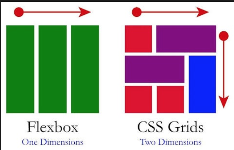
CSS Grid Layout or Grid is a two dimensional method for cascading style sheets, using a programming language that defines the layout of an HTML web page. It is a system that lets the web developers design smart and engaging layouts and grid structures using only the CSS.
Traditionally, most of the grid based layouts were created by flexbox and floats in CSS, but in CSS Grid System designers go step by step because of its unlimited possibilities and flexibility. However, both Grid and Flexbox can coexist and work together in the same web page.
Web designers can use Grid to construct more reliable and simple layouts for complicated responsive websites. It enables the designer to align design elements into rows and columns, giving them a more tidy look.
Examples of CSS Grid can be seen in, but not limited to:
- Menu of restaurants
- Bullet journal or magazines
- News bulletin
- Luxury brands
- Clothing Stores
- Online grocery stores
In 2023, asymmetrical style will become even more popular among modern web designers as it brings more power for print layout to the web.
No. 4: One-Page Format of Insightful Narratives
It is essential to develop interesting tales in your content to make your website more engaging and functional. Illustrations and story telling is a relatively new concept in web design that will continue to flourish more in 2023.
The premise is simple; Keep most, if not all, of your website elements (from text to graphics and navigation buttons) on a single page. Users are then expected to scroll to view the website in sections transitioning smoothly with sliding animation. This way you can leverage any strong element in your web page such as a fixed menu bar, anchor links, side bar, navigation bar etc.
One page format, if done correctly, can create a fun, unique, yet funcional, user experience without the burden of navigating pages and links. This is more goal oriented, develops a strong call to action, and constructs easy-to-reach navigational elements.
There are very few websites that have successfully been able to create captivating narratives while giving a unique, yet delighted, user experience to its target audience. Some of these winning websites are:
No. 5: Thumb friendly Mobile Navigation
In anticipation of mobile surfing to grow in 2023, it is not enough to have a responsive website, rather it should also be user friendly on multiple devices.
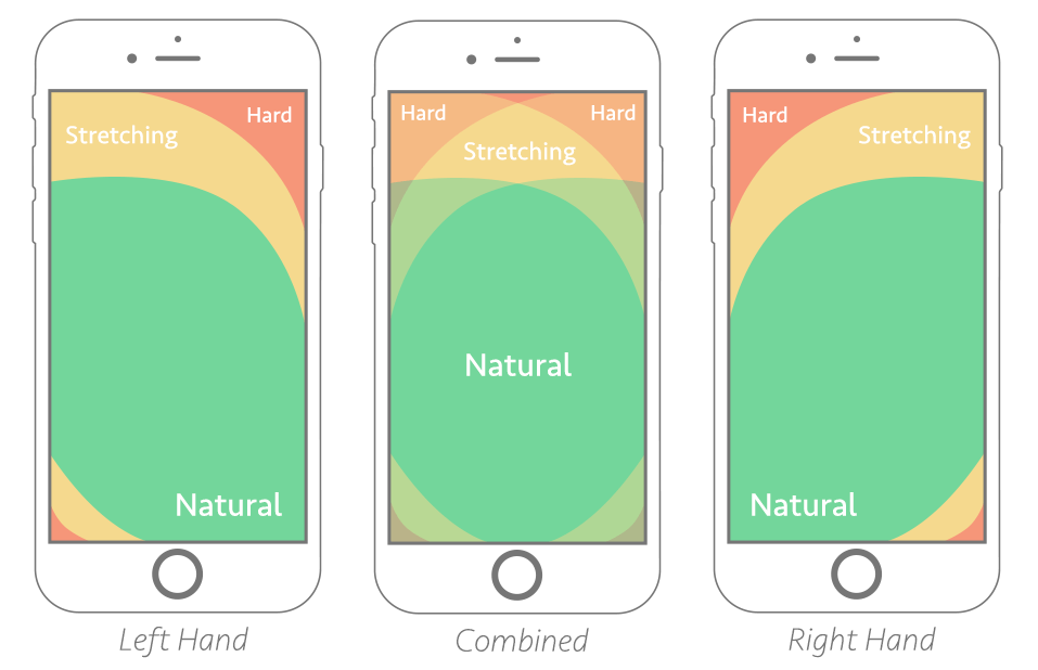
Thumb-friendly means that the content, buttons, menu and navigation bars should all be in the space any user’s thumb can reach. The center of the screen is a more preferred position as it makes it more comfortable for the users, maximizing the design elements of your website.
Modern web designers will increasingly rely on mobile responsive animations and videography. It allows:
- A clean responsive design maximizes the use of white space
- Images and other elements are arranged in an easy-to-glance way providing for targeted information sharing
- Keeps the content interactive and with in the reach of users
Conclusion
These are some of the trends that will continue to be significant in 2023. If you are looking for a web design or re-design for your website, make sure these top trends are at the forefront.
Author Bio:
Muhammad Arbaz is a business development executive working for a web development company, Perception System. He works closely with B2B and B2C companies providing valuable solutions. Contact Muhammad by visiting his LinkedIN profile for more information.
